Departures: History of Our Color Blue
“Petroski is quick to point out that Massican is more than just a wine; he wants it to evoke a lifestyle, one of aspiration and travel. Color—specifically, owning a color—was paramount to the brand refresh.”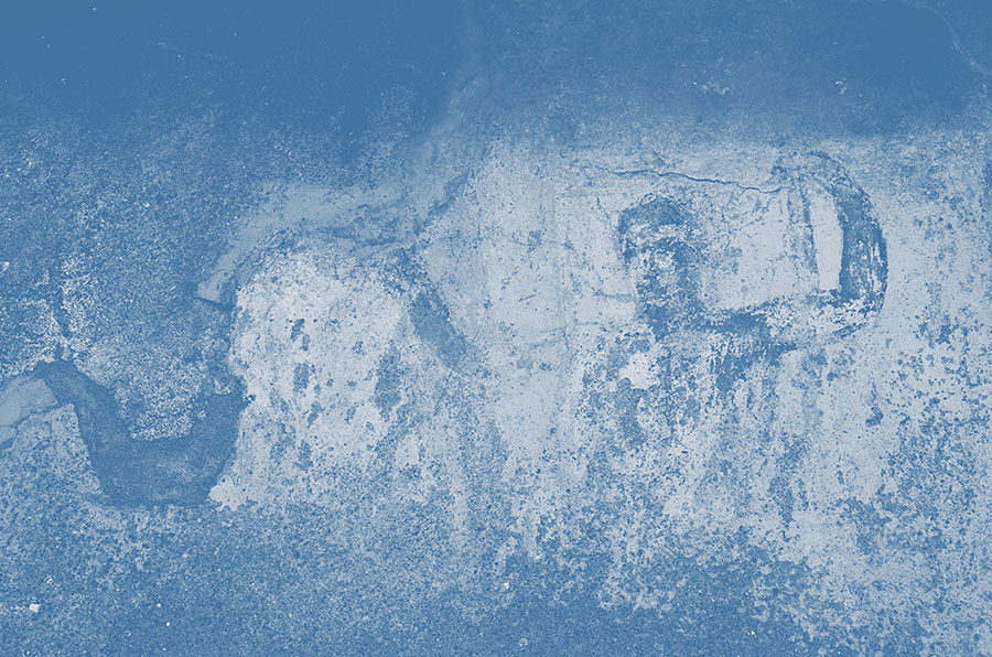
BY CREATING A WINE, THIS WINEMAKER CREATED A COLOR
By day, Dan Petroski cultivates some of the most sought-after cabernets and Bordeaux-style blends at Larkmead Vineyards in Napa Valley,but his personal project, Massican, looks to Italy for inspiration. This boutique line of wines focuses on white Italian grape varieties, all cultivated in Napa. When it came time to celebrate the label’s tenth anniversary, Petroski wanted a brand redesign that expressed Massican’s evolution, while giving it stronger ties to the past.
Petroski is quick to point out that Massican is more than just a wine; he wants it to evoke a lifestyle, one of aspiration and travel. Color—specifically, owning a color—was paramount to the brand refresh. He wanted the color to bring up the same emotions that one feels reflecting back on a life-changing vacation, the one still spoken about fondly and wistfully.
Working with NYC-based design firm Sub Rosa, Petroski and the team identified several touch points to tell the Massican story, with color central to the plot. Soon after, he learned about the Forbes Pigment Collection at Harvard University, and reached out to Narayan Khandekar, Director of the Straus Center for Conservation and Technical Studies, Harvard Art Museums, in hopes of gaining more insights into color. Although the collection is private and meetings are appointment only, Khandekar took an interest in the project.
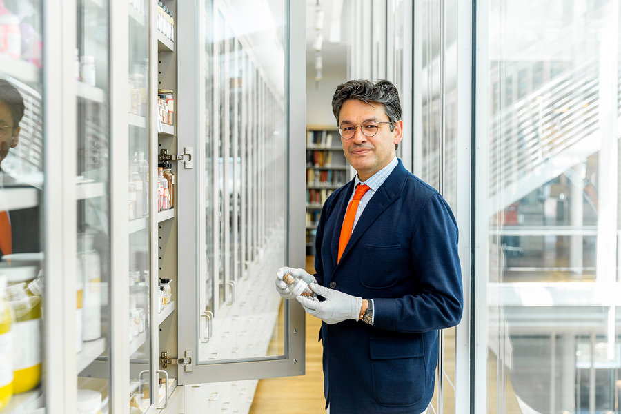
This unique archive is a time capsule for color. Founded by former Fogg Museum director Edward Forbes in the early 1900s, it collects color specimens for reference and research. “Pigments are different from color; pigments are microscopic, colored particles and they can be used to give paint its color,” explains Khandekar in an email. “Some pigments do change color over time: vermilion can change from a bright coral orange to a deep chocolate brown on exposure to UV light; eosin, which was used a lot by van Gogh, can fade very quickly, so some of his skies changed from a vibrant red to an overcast gray soon after they were completed. There are colors like Indian yellow that were once made from dried urine of cows fed on mango leaves, but it is now something that looks close color-wise but is made in a lab and chemically completely different from the original. Without having a sample of genuine Indian yellow, we would not have been able to identify it in an early painting by Georges Seurat.” For art restorers, the library is an invaluable resource when trying to recreate color from the exact period of creation. From a broader global perspective, Khandekar also says the samples helped trace trade routes throughout Europe and Asia.
During their meeting, where Petroski told him about the wines and his family roots in Monte Massico, Italy, Khandekar directed him towards Pompeii. One particular hue he had in mind, Pompeiian blue, has connections to Egyptian blue, which Khandekar describes as a 5,000-plus year-old glassy pigment.
Calling it his “Indiana Jones” moment, the winemaker headed to Italy in search of the tone, which he ultimately located on a 1,500-year-old fresco. Due to the climactic conditions of Pompeii, as well as its proximity to the sea, color takes on what Petroski calls, “sea-worn, salty colors,” although they didn’t start out that way. “In Italy, they couldn’t figure out how to preserve the color intensity over time as it was being weathered,” says Petroski. With family roots in the area, the winemaker figured it was quite feasible that “my grandparents, my great-grandparents, who grew up near there probably saw this fresco and probably visited this place.” He cataloged this piece of inspiration via photos for later identification at home.
Pompeii spoke to him in other ways; a center of commerce thousands of years ago, Pompeii had a robust wine trade with neighboring regions of Campania, Puglia, and Greece. As a hive of culture and culinary, it felt like a homecoming for the Massican brand.
Once back stateside, Petroski and Sub Rosa carefully analyzed the photos with digital technology, eventually landing on the exact pigment they wanted for the Massican label. Although it’s almost impossible to trademark color, Petroski still considers this particular hue his proprietary color. “[Massican blue] is the epitome of the brand, and that kind of comforting feeling of your own personal relationship with nostalgia and romance and color,” says Petroski.
To extend the meaning of the color beyond his label, “Blue,” became the theme for the first issue of Massican’s Instagram-only magazine, in partnership with publishing house Phaidon. Launched in July, during what would have been the height of vacation season in non-pandemic times, “that ‘Blue’ issue for me was kind of a destination…whether it be the Mediterranean Sea or the sky in a mountain town,” says Petroski.
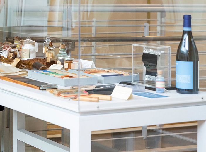
Although Petroski can’t make any official claims on the tone, Massican blue is noteworthy in another way; it is now documented in the Forbes Pigment Collection. A bottle, associated printed material, and cardboard packaging all hold a permanent place in the archives. Furthermore, these items were featured in the Collection’s annual showcase display, positioned outside the color library, for the 2019 – 2020 academic year.
Once a bottle of wine is opened, it tends to disappear quickly, but thanks to the Forbes Pigment Collection, Massican, and Massican blue, will live on indefinitely.
By Shana Clarke, Departures Magazine, December 2020